Creates a quantile-quantile plot from p-values from a GWAS study.
snp_qq(gwas, lambdaGC = TRUE, coeff = 1)Arguments
- gwas
A
mhtestobject with the p-values associated with each SNP. Typically, the output of bigstatsr::big_univLinReg, bigstatsr::big_univLogReg or snp_pcadapt.- lambdaGC
Add the Genomic Control coefficient as subtitle to the plot?
- coeff
Relative size of text. Default is
1.
Value
A ggplot2 object. You can plot it using the print method.
You can modify it as you wish by adding layers. You might want to read
this chapter
to get more familiar with the package ggplot2.
Examples
set.seed(9)
test <- snp_attachExtdata()
G <- test$genotypes
y <- rnorm(nrow(G))
gwas <- big_univLinReg(G, y)
snp_qq(gwas)
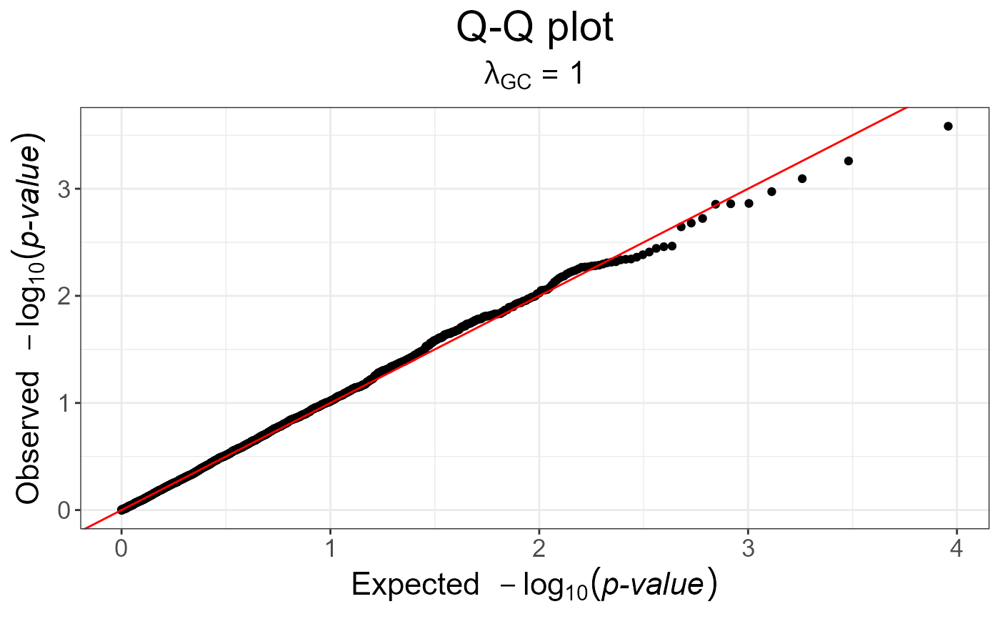
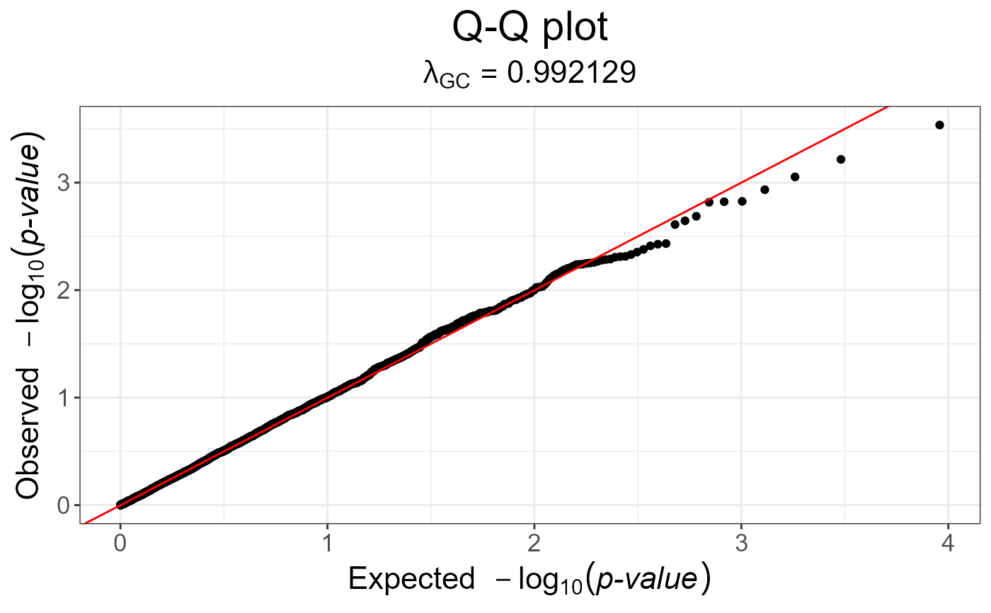 gwas_gc <- snp_gc(gwas) # this modifies `attr(gwas_gc, "transfo")`
snp_qq(gwas_gc)
gwas_gc <- snp_gc(gwas) # this modifies `attr(gwas_gc, "transfo")`
snp_qq(gwas_gc)
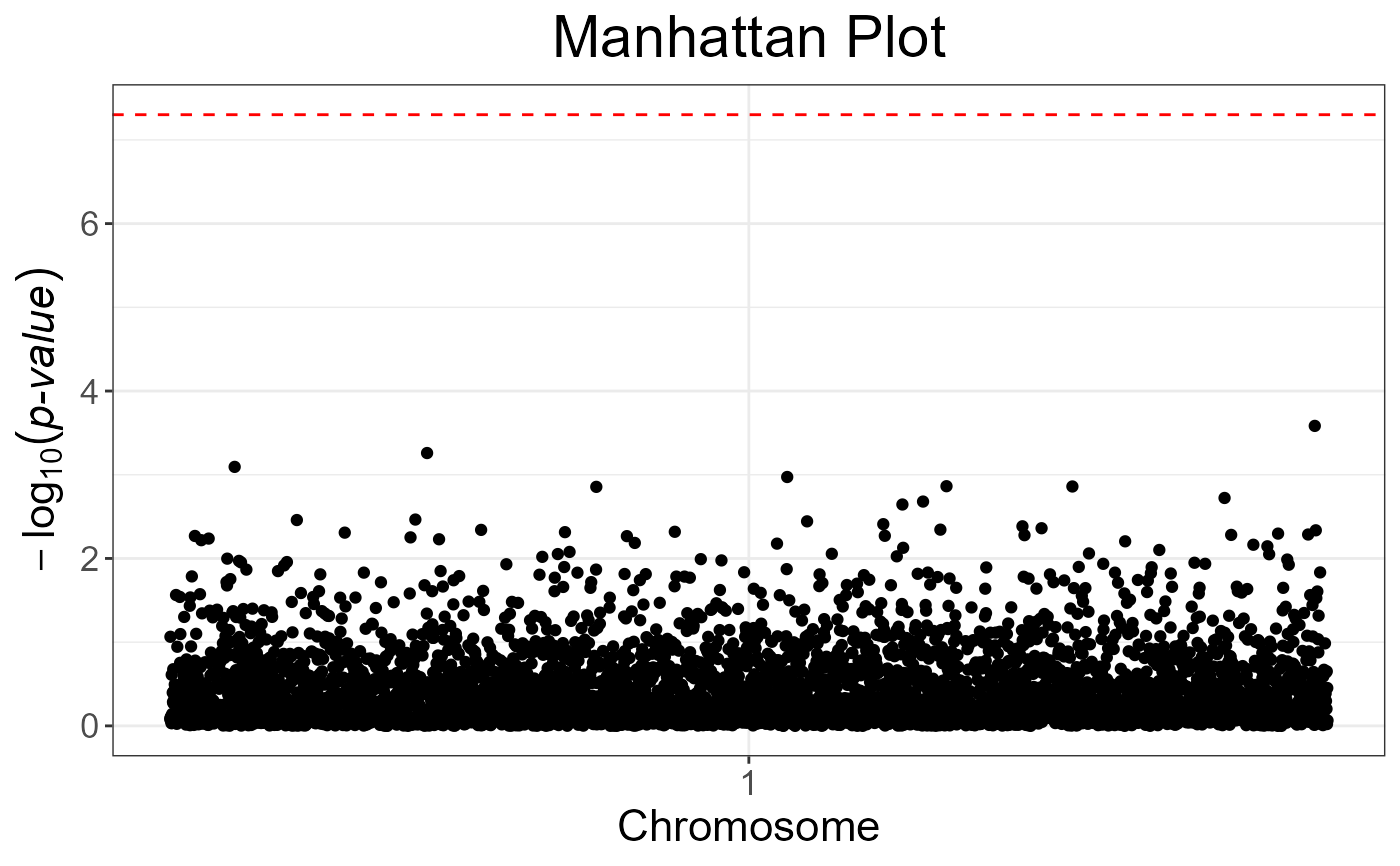
 # The next plot should be prettier with a real dataset
snp_manhattan(gwas_gc,
infos.chr = test$map$chromosome,
infos.pos = test$map$physical.pos) +
ggplot2::geom_hline(yintercept = -log10(5e-8), linetype = 2, color = "red")
# The next plot should be prettier with a real dataset
snp_manhattan(gwas_gc,
infos.chr = test$map$chromosome,
infos.pos = test$map$physical.pos) +
ggplot2::geom_hline(yintercept = -log10(5e-8), linetype = 2, color = "red")
 p <- snp_qq(gwas_gc) +
ggplot2::aes(text = asPlotlyText(test$map)) +
ggplot2::labs(subtitle = NULL, x = "Expected -log10(p)", y = "Observed -log10(p)")
if (FALSE) plotly::ggplotly(p, tooltip = "text")
p <- snp_qq(gwas_gc) +
ggplot2::aes(text = asPlotlyText(test$map)) +
ggplot2::labs(subtitle = NULL, x = "Expected -log10(p)", y = "Observed -log10(p)")
if (FALSE) plotly::ggplotly(p, tooltip = "text")